CTA button centered
CTA button centered.
Default Accordion
Default Accordion. Accordion that displays post from specified CPT. You can also add module title to it. Its a dynamic accordion.
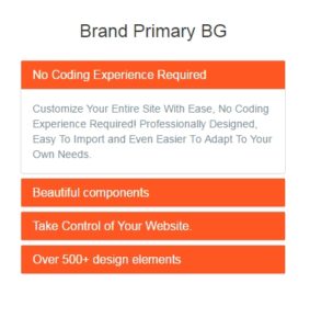
Accordion Brand Primary BG
Accordion that displays post from specified CPT. You can also add module title to it. Its a dynamic accordion with brand primary background color.
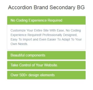
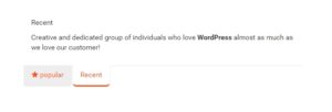
Accordion Brand Secondary BG
Accordion that displays post from specified CPT. You can also add module title to it. Its a dynamic accordion with brand secondary background color.
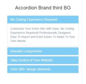
Accordion Brand Third BG
Accordion that displays post from specified CPT. You can also add module title to it. Its a dynamic accordion with brand third background color.
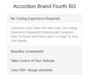
Accordion Brand Fourth BG
Accordion that displays post from specified CPT. You can also add module title to it. Its a dynamic accordion with brand fourth background color.
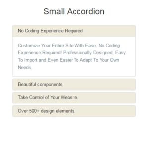
Accordion Small Title
Small Accordion that displays post small title from specified CPT. You can also add module title to it. Its a dynamic accordion.
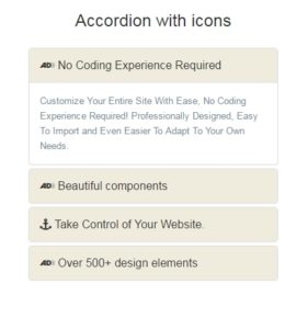
Accordion with icons
Accordion that displays post from specified CPT. You can also add module title to it. Its a dynamic accordion. This module displays font awesome icons using meta field.
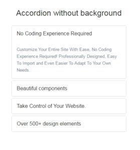
Accordion without background
Plain, simple & basic accordion that displays post from specified CPT. You can also add module title to it. Its a dynamic accordion.
CTA with brand BG & button
CTA with brand BG & button
CTA Light border
cta-light-border
CTA Thick border
CTA Thick border

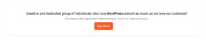
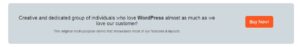
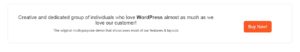
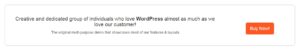
CTA Default Button
CTA module displays section title and section description with button. All parameters can be passed using module parameters.
CTA with Background Image
Note to Bhagyashree

CTA Get Started
CTA module with section title & description on top followed by CTA button and footer text for the module. All parameters can be passed via module parameters.

CTA Style 25
CTA module with title, description, button and link. All text with button link and button text can be passed via module parameters.

CTA Button Small
CTA with title text and button/link.

CTA with Bg Image
CTA module with title, text, background image and single button/link.
CTA Style 16
CTA with title text and button/link.
CTA Style 17
Very simple CTA with single button and text below it.

CTA style 18
CTA with title, text and button with background image.
CTA with title and 2 column block
CTA with 2 boxes and main title. Transparent content boxes with background image.

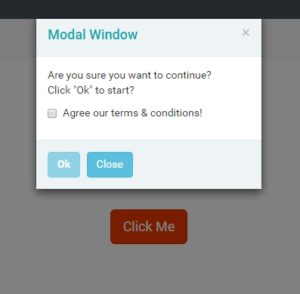
CTA - modal popup with subscribe button
CTA module that opens up a modal window on button click.
CTA Style 28
CTA Module: 2 different sized titles and text with image on right. This is useful for app websites where users can download the app via link or appstore link can be sent via SMS.

Swiper - Default Setup
Swiper Slider - Default Setup
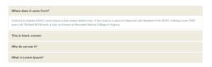
Alert – terms agreement confirmation box
This module is an Alert box. A modal window popups when you click on the button. All text & links can be set via module parameters.
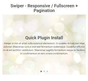
Swiper - Responsive / Fullscreen + Pagination
Swiper Slider - Responsive / Fullscreen + Pagination
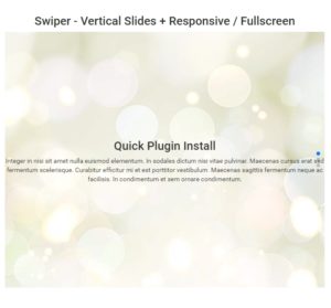
Swiper - Vertical Slides + Responsive / Fullscreen
Swiper Slider - Vertical Slides + Responsive / Fullscreen
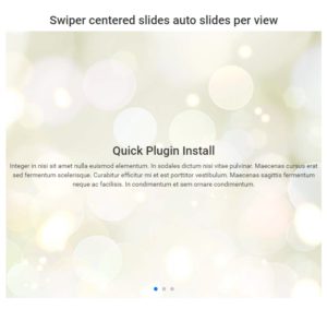
Swiper - Centered slides auto slides per view
Swiper Slider - Centered slides auto slides per view
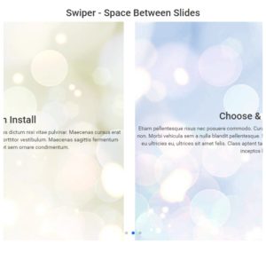
Swiper - Space Between Slides
Swiper Slider - Space Between Slides
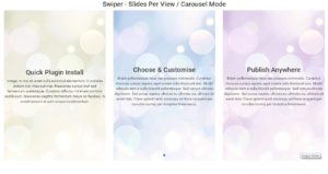
Swiper - Slides Per View / Carousel Mode
Swiper Slider - Slides Per View / Carousel Mode
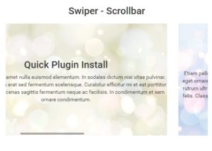
Swiper - Scrollbar
Swiper Slider - Scrollbar
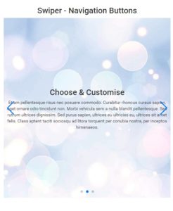
Swiper - Navigation Buttons
Swiper Slider- Navigation Buttons
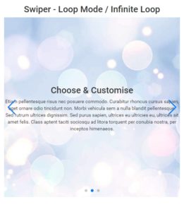
Swiper - Loop Mode / Infinite Loop
Swiper Slider - Loop Mode / Infinite Loop
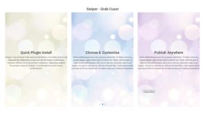
Swiper - Grab Cusor
Swiper Slider - Grab Cusor
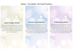
Swiper - Free Mode / No Fixed Positions
Swiper Slider - Free Mode / No Fixed Positions
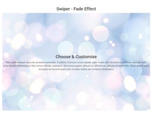
Swiper - Fade Effect
Swiper slider module with fade effects.
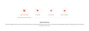
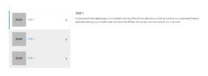
Tabs - Dynamic - with Big Icon
Dynamic Tabs with large animated icons displaying post from custom CPT.

Tabs Dynamic Justified
Dynamic Tabs that displays post from custom CPT. The first tab has customizable icon.
Tabs - Static Bottom
Static two tab module with tabs at bottom.
Tabs - Static - With Big Icons
Static tabs module with large animated icons.
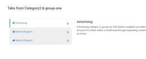
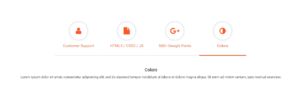
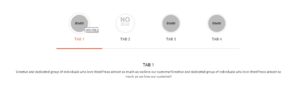
Tabs Navigation Dynamic
Dynamic Tab module which displays post from custom CPT and taxonomy(Type & Group). This is a vertical tab module with font-awesome icons.
Tabs navigation image dynamic
Dynamic Tab module which displays post from custom CPT and taxonomy(Type & Group). This is a vertical tab module with featured images icons.
Tab Navigation 6 tabs
6 Static tab modules that displays content using parameters. This module is a vertical tab module with tabs on left and content on right.
Tabs with image - dynamic
Dynamic tab module that displays post from custom CPT. The highlighted tab color can be passed using the tab_color parameter. This tab uses featured images and post title as tabs.
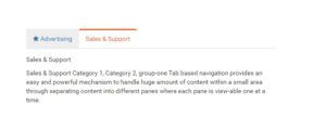
Tabs Default
This is a static 2 tab module to display simple text. The content can be passed using the parameters along with icon and color.
Tabs Default Dynamic
Dynamic tab that displays post from CPT using taxonomy "type" & "group".The first tab icon can be replaced with any icon using the tab_icon parameter. The highlighted color can be changed using tab_color parameter.
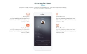
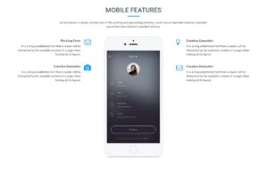
Featured - title text with 4 content boxes and centered image
Static featured product/service module to display images with features. The image is center aligned with featured text.You can display 4 featured boxes.
Featured - title text with 4 content boxes inline icons and centered image
Static featured product/service module to display images with features. The image is center aligned with featured text.You can display 4 featured boxes.
Dynamic Featured - title text with 4 content boxes inline icons and centered image
Dynamic featured product/service module to display images with features. The image is center aligned with featured text.
Content Box - left icon and link
Static content box with icon on left beside the title and description and button link below it. The colors, title, description and button link with text can be passed via module parameter.
Content box Icon with title Dynamic
Dynamic content boxes with icon besides the title and description with button below it. The content is displayed via custom CPT. The iconcolor and hover colors can be passed via module parameters.
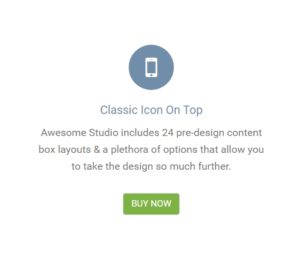
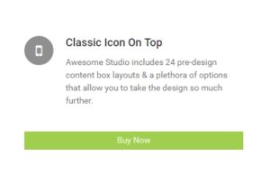
ContentBox Classic Icon On Top
Static content box with vertical layout. The module displays Icon, title, description, and button with links. All text and color can be passed via module parameters.
Content box Icon-on-top Dynamic
Vertical dynamic content boxes that displays data from custom CPT. The module displays icon, title, description and linked buttons. The colors can be passed via module parameters.
contentbox-classic-icon-side
Static content box module with icon on left. The title description and button with links can be configured via module parameters. The colors and hover colors can also be passed via module parameters.
Contentbox - Icon-on-side Dynamic
Vertical dynamic content boxes that displays data from custom CPT. The module displays icon, title, description and linked buttons. The colors can be passed via module parameters.
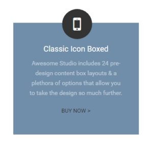
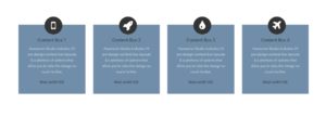
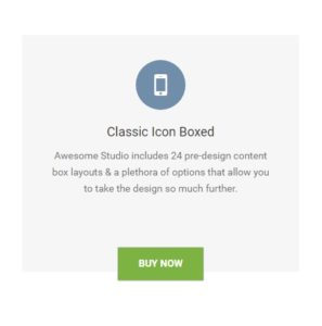
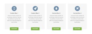
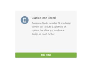
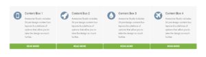
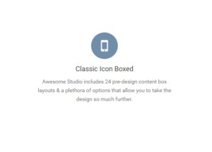
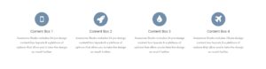
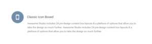
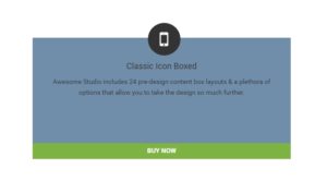
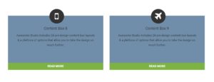
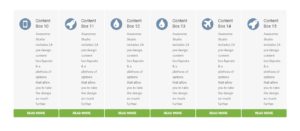
Content Box – Classic Icon Boxed
Static content box that displays data from custom CPT. The module displays icon, title, description and linked buttons. The colors can be passed via module parameters.
Contentbox- Icon-boxed Dynamic
Vertical dynamic content boxes that displays data from custom CPT. The module displays icon, title, description and linked buttons. The colors can be passed via module parameters.
Contentbox - Clean Layout Vertical
Static vertical layout content box displaying icon, title and description with buttons. The module displays content using module parameters. The color and hover colors with background colors can be passed via module parameters.
Contentbox - Clean-layout-vertical Dynamic
Dynamic vertical layout content box displaying icon, title and description with buttons. The module displays content from custom CPT. The color and hover colors with background colors can be passed via module parameters.
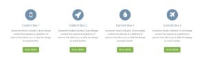
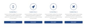
ContentBox - Clean Layout Horizontal
Clean static content box displaying icon title and description with button at bottom. Each element can be passed via module parameter.
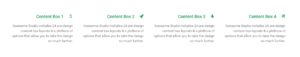
Contentbox - Clean-layout-horizontal Dynamic
Content box module with four column layout. This module displays icon, title, description and link for each box's. It is a dynamic module displaying data from custom CPT.
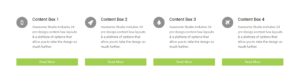
Contentbox - Timeline Horizontal
Static content box with icon on top and title description below it. The icon color, icon hover color, title, description and link can be passed using module parameter. The width of the module can also be set using the grid class parameter. You can use bootstrap column classes.
Contentbox - Timeline-horizontal - Dynamic
Dynamic content box displaying post from custom CPT. The module displays icon, title and description in horizontal format. the icon color and hover colors can be passed via module parameters.
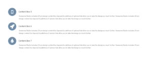
Content Box - Timeline Vertical
Static content box with icon on left and title description on right. The icon color, icon hover color, title, description and link can be passed using module parameter. The width of the module can also be set using the grid class parameter. You can use bootstrap column classes.
Contentbox - Timeline-vertical - Dynamic
Dynamic vertical content box which displays content from CPT. Displays icon with title, description and button with link.
Content Box - Column Sizes 1-6
Static content box with 50% column width. Displays icon with title, description and button with link.
Contentbox - 2 column sizes- Dynamic
Dynamic content boxes with two column boxes. The post are displayed from CPT. The colors can be configured using module parameters.
ContentBox - Clean Layout Horizontal - Dynamic
Dynamic content boxes with colored icons with hover effect. The post are displayed from CPT. The colors can be configured using module parameters.
Contentbox - Colored-icon - Dynamic
Dynamic content boxes with colored icons with hover effect. The post are displayed from CPT. The colors can be configured using module parameters.
Content Box – Colored Icon
Static content box with small icon on left beside the title. The icon and buy button have hover effect which changes color. The title, icon, description and button text with link and color can be passed using module parameters.
Content Box – Icon Sizes
Static content box with icon on top above the title. The icon and buy button have hover effect which changes color. The title, icon, description and button text with link and color can be passed using module parameters.
Contentbox - Icon-sizes- Dynamic
Dynamic content boxes with icon hover effect. The post are displayed from CPT. The colors can be configured using module parameters.
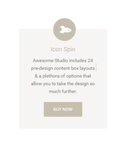
Content Box - Icon Spin
Static content box with hover effect. The icon spins 360 degree. Displays icon with title, description and button with link.
Contentbox - Icon-spin - Dynamic
Dynamic content boxes with rounded icons with 360 degree spin effect. The post are displayed from CPT. The colors can be configured using module parameters.
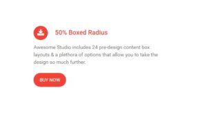
Content Box - 50% Boxed Radius
Static content box with icon on left beside the title. The icon and buy button have hover effect which changes color. The title, icon, description and button text with link and color can be passed using module parameters.
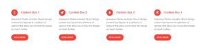
contentbox-50%boxed-radius-dynamic
Dynamic content boxes with rounded icons with hover effect. The post are displayed from CPT. The colors can be configured using module parameters.
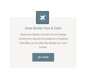
Content Box - Icon Inner Border
Static content box with hover effects. Displays icon with title, description and button with link.
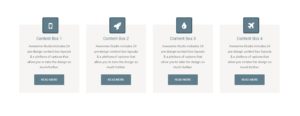
contentbox-icon-inner-border-dynamic
Dynamic content boxes with icon hover effect. The post are displayed from CPT. The colors can be configured using module parameters.
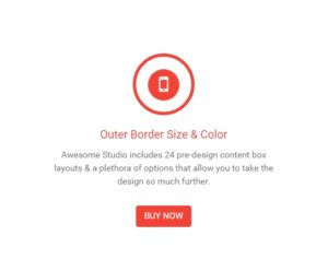
Content Box – Icon Outer Border
Static content boxes with animated icon effect. The colors and content can be configured using module parameters.
contentbox-icon-outer-border-dynamic
Dynamic content boxes with animated icon effect. The post are displayed from CPT. The colors can be configured using module parameters.
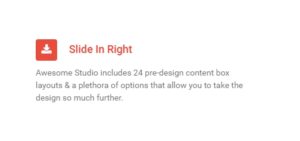
Content Box - SlideInRight
Static content boxes with animated Slide-in-right effect. The colors and content can be configured using module parameters.
contentbox-slideinright-dynamic
Dynamic content boxes with animated Slide-in-right effect. The post are displayed from CPT. The colors can be configured using module parameters.
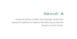
Content Box - SlideInLeft
Static content boxes with animated Slide-in-left effect. The colors and content can be configured using module parameters.
Contentbox - slideinleft- Dynamic
Dynamic content boxes with animated Slide-in-left effect. The post are displayed from CPT. The colors can be configured using module parameters.
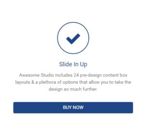
Content Box - SlideInUp
Static content boxes with animated Slide-in-up effect. The colors and content can be configured using module parameters.
Contentbox - Slide-in-up - Dynamic
Dynamic content boxes with animated Slide-in-up effect. The post are displayed from CPT. The colors can be configured using module parameters.
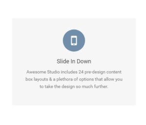
Content Box - SlideInDown
Static content boxes with animated Slide-in-down effect. The colors and content can be configured using module parameters.
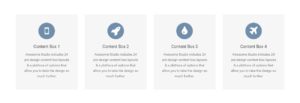
Contentbox - Slideindown - Dynamic
Dynamic content boxes with animated Slide-in-down effect. The post are displayed from CPT. The colors can be configured using module parameters.
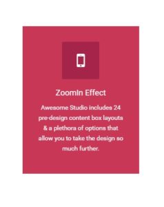
Content Box - ZoomIn
Static content boxes with animated zoom-in effect. The colors and content can be configured using module parameters.
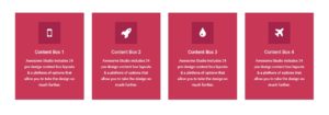
Contentbox - Zoomin - Dynamic
Dynamic content boxes with animated zoom-in effect. The post are displayed from CPT. The colors can be configured using module parameters.
Content Box - ZoomIn with Icon Effect
Static content boxes with animation effects. This module displays content via module parameters. The colors can be set via module parameters.
Contentbox - Zoomin-with-icon-animation - Dynamic
Dynamic content boxes with animation effects. This module displays post from custom CPT. The colors can be set via module parameters.
Content Box - Image
Content box module with single column grid layout. This module displays feature image, title, description and buy now button for box's. It is a dynamic module displaying data from custom CPT.
Featured Content - Two column-title-with-image-animation-left
Featured content module to display services or products. You can display featured image with title text. This is a static module.
Featured Content - two-column-title-with-animation-image-on-right
Featured content module to display services or products. You can display featured image with title text. This is a static module.
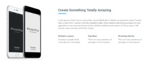
Featured Content - title-description-button-and-image
Featured content module to display services or products. You can display featured image with title text and single link. This is a single column static module.
Featured Content - 2 column image title description button
Featured content module to display services or products. You can display featured image with title text and single link. This is a static module.
Featured Content - 2 column title text button image on right
Featured content module to display services or products. You can display featured image with title text and single link. This is a static module.
Featured Content - with image-title-text-image-2buttons
Featured content module to display services or products. Two column format to display featured image with title text and two buttons with links. This is a static module.
Featured Content - title-text-3column-text
Featured content module to display services or products. You can display featured image with title text and 3 column content for additional information regarding the same. This is a static module.
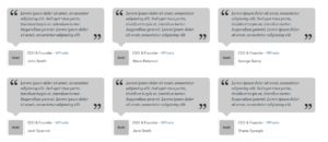
Testimonial - Type 1
Three column boxed testimonial module that displays testimonial text, name, image, designation, company name and link to their web pages. The background color can be customized via color parameter.
Testimonial - Type 2
Three column centered testimonial module that displays testimonial text, name, image, designation, company name and link to their web pages. The background color can be customized via color parameter.

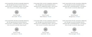
Testimonial - Type 3
Three column boxed testimonial module that displays testimonial text, name, designation, company name and link to their web pages. The background color can be customized via color parameter.
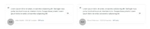
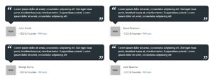
Testimonial - Type 4
Two column boxed testimonial module that displays testimonial text, name, designation, company name and link to their web pages. The background color can be customized via color parameter.
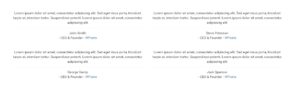
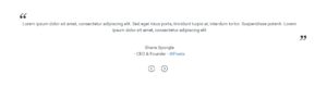
Testimonial - Type 5
Two column centered testimonial module that displays testimonial text, name, designation, company name and link to their web pages. The background color can be customized via color parameter.
Testimonial - Type 6
Two column testimonial module that displays testimonial text, name, image, designation, company name and link to their web pages. The background color can be customized via color parameter.
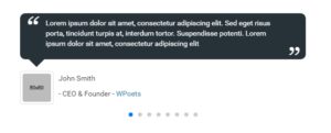
Testimonial with Carousels
Testimonial slider module with profile image.
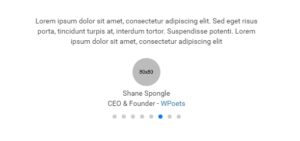
Testimonial with carousels center
Testimonial slider module with profile image.
Testimonial with arrow carousels
Testimonial module slider with customizable arrows.
Testimonial with background image
Testimonial slider module with background image.

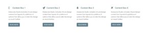
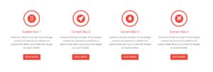
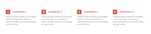
Content box with 3 column boxes
Static module to display 3 column content box. On hover it displays title with description and links to link to your other pages.

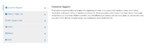
Logos with images, title & content
Dynamic module to display your client logos from custom CPT. You can manage logos using group and type taxonomy.
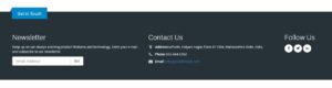
Footer Type 1
Footer module to display Newsletter subscription form, contact information and social web links.

Team Style 2
Module to display your team members. This module displays team members image with designation, role and information about them.

Team Style 3
Module to display your team members. This module displays team members image with designation, role and social profile web links about them.

Team Style 7
Module to display your team members. This module displays team members image with designation, role and information about them. This module displays Name and designation on mouse roll-over.

Team Style 4
Module to display your team members. This module displays team members image with designation, role and information about them. Simple module with no animation.

Team Style 6
Module to display your team members. This module displays team members image with designation, role and information about them.

Team Style 5
Module to display your team members. This module displays team members image with designation, role and information about them. Module displays member profile in a modal window.
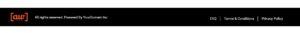
Copyright Style 1
Copyright bar with links and copyright information. Links can be edited in wp back-end menu.
Copyright Style 3
Copyright bar with links and copyright information. Links can be edited in wp back-end menu.
Copyright Style 2
Copyright bar with social links and copyright information. Social links can be updated using Awesome Studio Settings.

Copyright Style 4
Copyright bar with social links and copyright information. Social links can be updated using Awesome Studio Settings.

Copyright Style 6
Copyright bar with links and copyright information. Links can be edited in wp back-end menu.